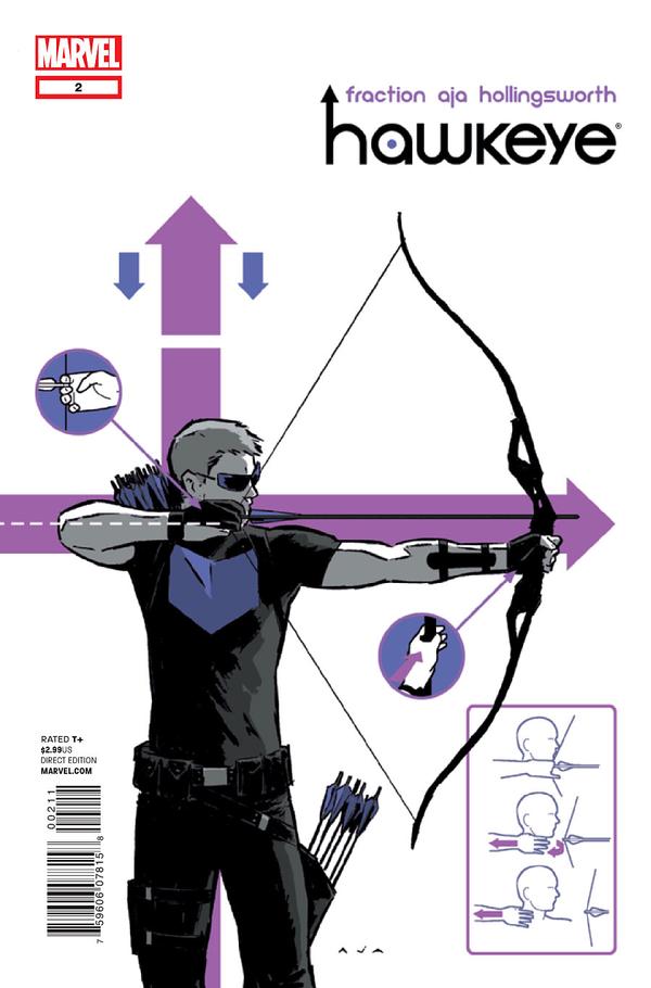
“Vagabond Code”
Hawkeye, no. 2
By Matt Fraction & David Aja
With Matt Hollingsworth
Marvel Entertainment, Nov. 2012
The stakes rise. Slowly. Not enough to wake its sleeping partner from its dreamy bliss. But the stakes rise. In “Lucky,” the first “Clint Barton Hawkeye Adventure,” Matt Fraction and David Aja introduce the titular character in a story so relaxed that it ran a danger of underwhelming the superhero audience. A quick search around the discussion blogs showed me that by and large, the audience was on board with it. “This is what he [Clint Barton] does when he’s not being an Avenger.” It was a simple hook that fits right in the groove of a certain genre of pop-action stories.
The key to “day off of nominal job” stories is that the “day off” adventure has to be dangerous but a bit goofier. The downside to the second Clint Barton Adventure, “Vagabond Code,” is that it doesn’t have the same loose, off-handed goofiness as “Lucky” had. Given that this story takes place in a circus, that’s a bit sad, to be perfectly cruel.
Perhaps it has to do with the color palate. The circus here is meant to conjure the famous Cirque de Soleil. Instead of a vibrant colorful “circus of the sun,” we are shown a monochrome, violet “circus of the night.” The aesthetic on its own is lovely but as a whole, using a violet motif for the setting of a Hawkeye comic detracts from the fact that the color field of violet (purple) is Hawkeye’s emblem. This is no accident. Remember the Hawkeye graffiti from “Lucky?” That was a warning that this Cirque du Nuit, with ties to Hawkeye’s past was to appear soon. So Hawkeye, the purple man, versus an organization made of purple. That aesthetic choice alone tells the story of this adventure.
xoxoxoxoxoxoxoxoxoxo
The most important part of this comic is David Aja’s designs. His page designs, his panel designs, his scene designs. He makes normal stuff seem miraculous and miraculous stuff seem normal. Kate Bishop says “Well that’s cool” but Aja rips the sentence out of time and slows it down to a film strip while Clint Barton’s time-speed is slow, yet faster than Bishop’s. A small scene of a man target shooting while talking with a woman. It is presented in objective time, subjective time to Barton and something slower than either perspective would consciously perceive. It is fun to imagine this overlapping montage of time-ideas occurring in an acted-out context.
There are lots of special effects–showy, ostentatious displays of comic book storytelling mastery. Maynard Tiboldt’s hypnotic spell, for example. Clint and Kate entering the hotel with the small inset panels tracking their movements through the crowd. Clint’s trick-shot at the end.
These are easy to spot and enjoy. That is what ostentatiousness is about! But the searching eye will find Aja’s talent runs far deeper than overt displays. Mirror the bookend scenes in Clint’s kitchen. The easy reveal of Clint’s planning board is not a bit deal but it also is THE big deal. He has this hidden from Kate the whole time. “My to-do list.” Or the tiny, stage-right introduction of Swordsman’s student. He isn’t given a name in the story but he is the prime antagonist. Such a pointedly unlabored introduction. There are the rock-solid compositions of Clint and Kate running through the ship. These panels as storytelling units are more intelligent and expertly designed while being more subtle than David Aja’s trick-shots.
xoxoxoxoxoxoxoxoxoxo
Matt Fraction’s dialogue is barely worth mentioning. Either people hate its overtly-snappy hipness or they enjoy its easygoing informality. I belong in the latter group. Fraction’s dialogue always strikes me as deliberately artificial. Like a story told second hand by your funny friend who knows just when to embellish or gloss over things to make the experience entertaining as well as the product of a confident narrative voice.
“(some Spanish-sounding stuff)” from the previous issue and “(some French stuff)” from this one. These flourishes take action comic book writing out of its agreed upon style of naturalism and place the writing genre in something more like an oral storyteller mode. It’s a familiar tendency for Fraction who employed such off-handed informality in his own “Casanova” series (drawn by Gabriel Bá and Fabio Moon) but feels more intentional in the context of a comic book which is part of a corporate entertainment company’s licensing plan. Something is happening intentionally here in “Hawkeye.” Like it or leave it, Fraction wants to have some fun with the formula that comic book readers have grown accustomed to.

