Happy Halloween! In honor of this, the most horrific of holidays, I carved a pumpkin to appease the dark gods! And those dark gods being, in order: Batman, David Mazzucchelli, and Dave Johnson. Anyway, let’s get to the details on how I ruined a great piece of art, and some suggestions on how you could salvage it if you wanted to do your own.
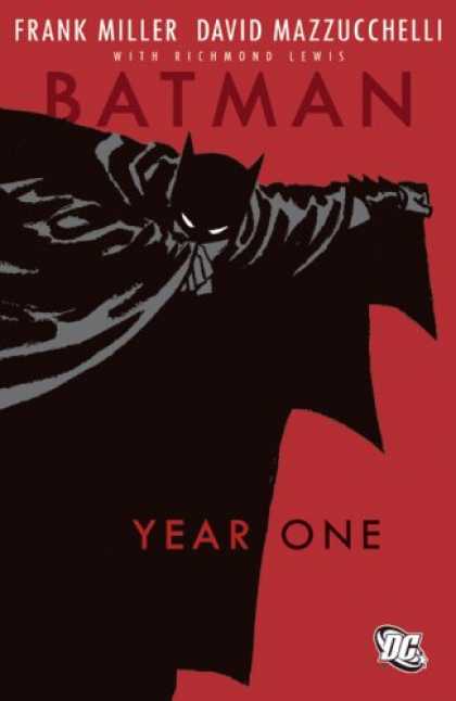
So, to start, last year I did a straight freehand carve off of this cover:
So, I just freehand copied it onto the pumpkin using a sharpie, and tried to get the folds in the cape right. Unfortunately, I completely messed up the proportions, since I was estimating the length of the lines free-hand. Also because I kind of suck at using a sharpie. Anyway, I didn’t snag a picture of last year’s because I was kind of embarrassed by it, but this year I really wanted to do better! But I also didn’t want to just copy the same exact design, lest I offend the Halloween spirit. So, I looked around for a similar picture that had that nice two-color distinction, since I figured I could carve something with that. I ended up going with this:
Look, I know it’s kind of a cheat, but it’s Dave Johnson drawing Mazzucchelli, how could I resist? Plus, that lettering is sweeeeet.
So, I did the freehand outline on my pumpkin again, and it actually didn’t turn out too bad! Despite my awful awful artistic ability, I was able to more or less copy it onto the pumpkin without wrecking the proportions too bad. I made some big mistakes, which I’ll go into, but first let’s see my train-wreck of a pumpkin.
So, anyway, the outline doesn’t look that bad, huh? Obviously, I messed up the hands because christ, hands are hard to draw even when you’re copying line for line. I’m pretty ok with how the letters turned out, even if this picture doesn’t show how good they started out before I cut into it.
Anyway, I clearly messed up on “A”s and the “B”, since both of those have holes in them, and I couldn’t decide how to do it. I realized too late that what I should have done was cut the A’s and B in horizontal half with the top and bottom halves connected to the larger pumpkin by sideways strands, which would have looked fine, and made the letters clearer. As far as the overall outline, I think I probably should have done a wider cut so the light could shine through better. Still not sure how to tackle the smaller details in the upper right quadrant, and I could probably have used some better lighting, but overall, I think it’s not the worst thing I’ve done.
What were your pumpkins like?


I would leave in the white parts and cut out the black. The cape is the only thing that looses the outline that way… and you could potentially just color in what’s left in black so you can still get cape definition… We should have a pumpkin party nest year and try it out 😉